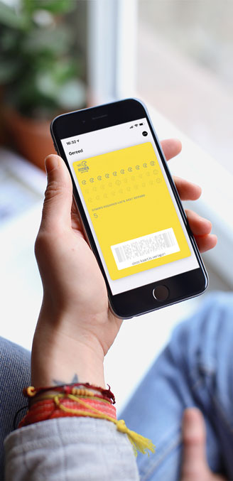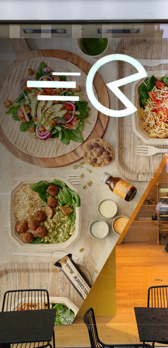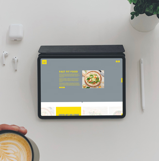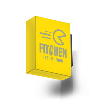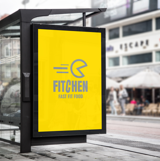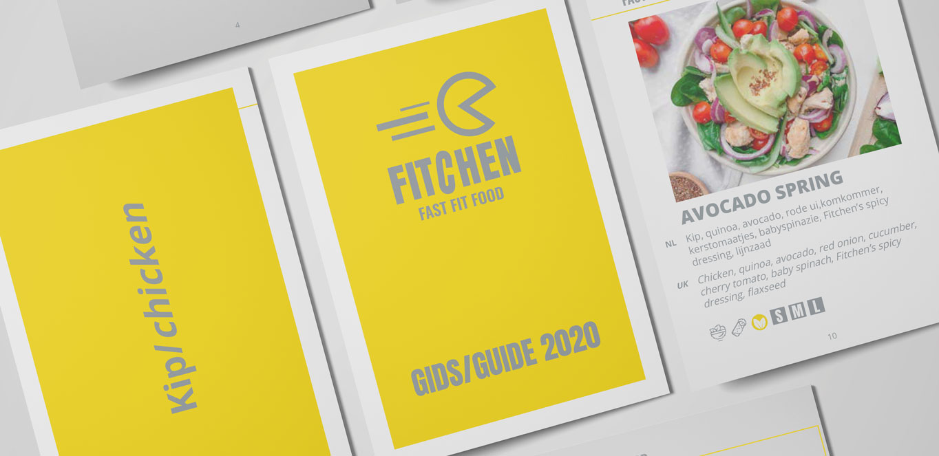
Fitchen. Fast. Fit. Food. More than just healthy food. Fitchen equals healthy fast food, that matches your busy schedule. This fast-growing company chain was in desperate need of a new look. We created a completely new corporate identity from the existing logo.
LOCATION
Gentplaats 1, 2000 Antwerpen
+32 475 26 42 18
Monkeys at Midnight cbva
BTW: BE06 0497 4845
CONTACT
Eddy Vergauwen
Graphic Director
+32475264218
© 2020 - MONKEYS AT MIDNIGHT